What makes a gator a gypsy?

teacher, traveler, photographer, political junky, smash and bash artist, grandmimi, mom, canine companion

Monday, October 6, 2014

Mixed Media Mayhem - Burn Bright

Gelli printing artists know that one could pull prints all day trying masks and stencils to get unique images.  For this journal page I was inspired by a post by Julie Fei Fan Balzer (http://balzerdesigns.typepad.com/) post.  I tore several random masks from deli paper leaving a stencil in the negative shape.  I used these to print orange and yellows on the page spread then I over printed with blue using a small circle stencil.  The shapes produced suggested necks, shoulders, and hair.  I copied two of my faces from my sketch book then lightly painted the faces in, drew and colored the eyes.  The orange and the bright eyes implied the text - Burn Bright


In the close-up pics you can see the background layering process.


Mixed Media Mayhem - Deep in the Forest

I submitted this journal page to Art Journal Journey for the October theme, Deep in the Forest. Printing of the Gelli plate with stencils from Crafters Workshop Aspen Trees and deli paper I ended up with several "rejects" to paste in my journal.

Saturday, September 20, 2014

Mixed Media Mayhem - Because I Want To...

The joy of art journaling is in the freedom from pre-conceived results...from even having a result...sometimes I just want to gesso over everything and close the page.  This journal page began as a love affair with gelatoes and modeling paste.  Once I had a highly textured surface of green and purple paisley shapes, I just didn't want to cover it up.  Weeks later an dried hibiscus flower fell out of a book where I had stashed it to dry.  The tissue thin, translucent petals needed a permanent home encased in gel medium...so I impulsively glued them to my pages.  The color of the bloom faded so I amped it up with a sheen of Lumiere halo pink paint and added the contrast of the dried painted fern... so by now I was down the rabbit hole, adding shading with pencil and light with gilding paste. Enough.  The perfect text for this overly embellished journal entry sprung to mind so I found some Gelli printed deli paper and wrote the quotation with gold pen.  Thus the gold is gilded and the lily (hibiscus) is painted.


Monday, August 18, 2014

Mixed Media Mayhem - Pain Management

While staying with my daughter this summer, I did not have my vast stash available.  Although there was a Michael's a mile away, I tried not to buy new materials unless it was really vital. Thus constrained, I used a lot of materials found around the house including magazine clippings and old
scrapbook paper.  One morning, members of a church rang the doorbell and left me some material.  I was struck by the notion of pain people feel and how they deal with it so this journal spread developed.  I loved the bold black and white of the scrapbook paper, but after I glued it down I had to make it recede.  I saw a sombre face emerge on the right side and I used words from the church pamphlet and a Philosophy skin care ad (a serendipitous pairing) to provide meaning.  Ideally the words would be on the right side so she would gaze at them, but since my journaling is unplanned...oh well. The close-up is to show the layers.This journal entry is supposed to show how one can emerge with mindfulness.


Tuesday, August 12, 2014

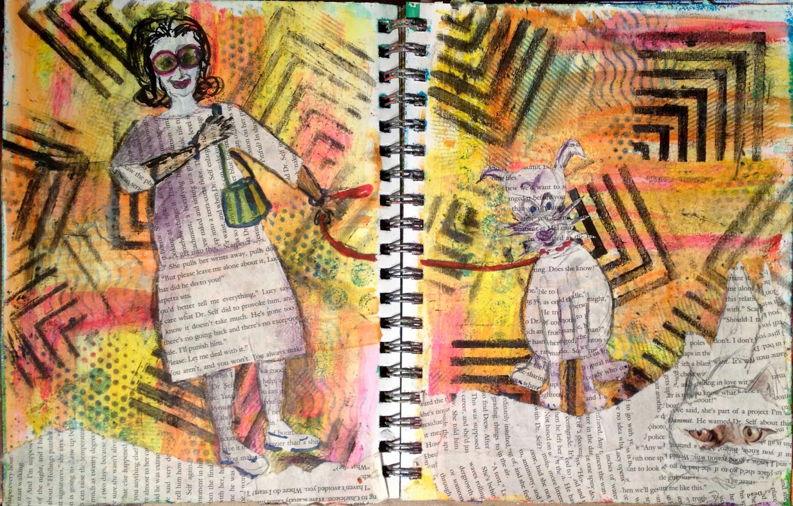
Mixed Media Mayhem - Opie Meets a Cat

This journal entry ended up being a tribute to my wacky Chorky, Opie…but it didn't start out that way.


 Faced with a blank white page, I approached the background with a random, "Let's try this".  I had some foam pieces from a Michaels sale that I used as stamps with Pitt Big Pens.  To block in some color I rubbed on Gelatoes.  "Ho Hum!"


I read on a blog that a good application of black could unify the composition…so I pulled out a graphic stencil and used a black Gelato and a baby wipe to rub on the black.  I started out small and then just went crazy and filled in both pages.  Gelatoes are water soluble..read smeary…so I put down a slapped on coat of clear gesso…a favorite product to avoid spray fixing. Wanting more layers I turned to some textured wallpaper to stamp on some contrasting color.  The background felt finished but I had no idea what to do with it so it stayed that way for days.


I had a discarded book on my bedside stand that I decided to use as the visual element.  I cut and pasted parts of the text to make a collaged girl and I gessoed and drew in her face…I hated it so I had to give her glasses and a focal piece to distract from her.  I drew and cut the dog, then grounded them with text paper, and drew the leash.  I saw the cat ad when having tea, and it just fit the space giving a reason for my dog's attention to that spot on the page.  One accident led to another which led to "Opie Meets a Cat".


Sunday, July 13, 2014

Mixed Media Mayhem - Of Mosques and Mausoleums

Do you know how artists say, "I just waited til it spoke to me?"  I always thought that was euphemistic speech for I had no plan.  This journal page, however, is exactly a progress of listening to the page to decide the direction.

The final images in this journal pages are inspired by my visit and my photographs of the Green Mosque (Yeşil Cami) in Bursa, Turkey. The Green Mosque, commissioned by Sultan Mehmet I Çelebi and finished in 1424, is an architectural gem of marble and mosaics in the rich blue green that is my most treasured color.


Faced with two blank pages I started where I often do...smushing gesso between the two and opening the page to reveal a texture.  Still enchanted with my new Dylusions inks and a new stencil, I randomly sprayed purple, green, turquoise, then dried and sealed the result.  I looked at these pages every day for weeks...where to go next.


The more I stared, the more I began to see architectural elements, specifically dome shapes.


Then, an epiphany...the colors and shapes brought back my trip to Turkey.  I rumaged my stash, my clip art, my photographs and came up with the domed mosques of Bursa and Edirne. To get some of the design on the page I tried transfers of clip art.  First I used several gel medium transfers which suggest a design but they are blurry.  Then I went to the old reliable packing tape transfer and enhanced them with gold leaf backing.  I used the transfers to collage a composition.


I let my pencil go to trace the outlines of domes and towers that I could see in the background.


I am not confident in my drawing skills, but as I let loose, I could draw in the shapes and components of the mosque forms.


As a historian by training, I had to ground this in some accuracy of representation so I used images of the actual mosque, photos of Mehmed I Çelebi (Ottoman: چلبی محمد, Mehmed I or Mehmed Çelebi) and my photos of the architectural details of the mosques and mausoleum.




Saturday, July 12, 2014

Mixed Media Mayhem - Fish Out of Water

Mixed Media Mayhem - Fish Out of Water

What's more fun than random Gelli printing?  Using a range of blues and violets, old wall paper scraps for stamps, and circle stencils and sequin waste, I made a a two page spread that, while stimulating the tactile sense (doesn't that Gelli plate feel great when you use your hands as a barren?), left me uninspired.  But this is an art journal.  It doesn't matter. It's just for fun.  Maybe I see bubbles, maybe a reef, so I drew a fish on it.  To give the fish presence, I colored him in with gesso and gave him stripes with yellow gelatos.  Since my drawing skills are minimal, the fish was ill proportioned.  To cover his distortion, I cut shapes from my scrap deli paper where I had cleaned off the Gelli plate to make some kind of reefy things.  I was really proud when my grandson, Brody, popped over my shoulder and recognized it saying, "Oh you drew a clown fish."  See...fourth graders and I have an understanding.